
|
Alyz Solutions
|
|
Graphing Interest Rates with Rpy
|
|
Graphing Interest Rates with Rpy
Table of Contents
Introduction
[ NOTE: An updated version of this document using rpy2 is available at Generating Graphs and Charts with Rpy2 ]
The U.S Government releases a large quantity of economic data on a regular basis on their web sites. In particular, interest rate data is released each business day and consumer price information is released monthly, with historical data readily available for download.
One of the most powerful and useful parts of R is its graphics engine. Combined with Rpy, which allows full access to the R engine from within a Python program, it becomes a breeze for anyone to generate sophisticated graphics to better illustrate any set of data.
While there are many excellent sources of information on generating R graphics [1], examples of using Rpy to generate graphics are difficult to find. We hope that the examples below will help anyone who wants to quickly get up to speed generating quality charts and graphics in python.
The intermediate data files in each of the examples below are stored in JSON format to remove the need for additional code to parse the data from text files. These examples require python 2.6 or later to be installed, as json was added as a standard library component in this version. If an older version of python is used, then either a compatible json library must be loaded, or each of the json.loads() calls can be changed to eval() calls with the corresponding "import json" removed, and the examples will still work properly since we only use a small subset of JSON that can be evaluated directly as python code.
Consumer Price Index (CPI-U)
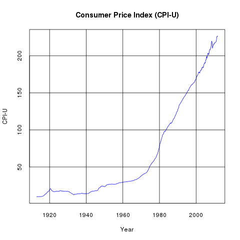
The U.S. Government releases Consumer Price Index data monthly. The most commonly used series in that data is the Consumer Price Index for All Urban Consumers. This data (cpiu.data) can be be used to generate the above line graph very easily with the following python program:
from rpy import *
import json

data = json.loads(file("cpiu.data").read())
years = [ x[0] + (x[1] - 1)/ 12.0 for x in data ]
cpiu = [ x[2] for x in data ]

r.png("r_cpiu.png")
r.plot(years, cpiu, xlab="Year", ylab="CPI-U", col="blue", type="l", tck=1)
r.title("Consumer Price Index (CPI-U)")
r.dev_off()
Components of the CPI-U
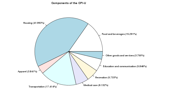
One of the many files distributed by the U.S. Government on the Consumer Price Index site provides the Components of the CPI-U. After extracting the summary information (cpiuparts.data) from this file, we can create the above pie chart to illustrate the different components and their proportions:
from rpy import *
import json

data = json.loads(file("cpiuparts.data").read())
names = [ "%s (%.03f%%)" % (x[0],x[1]) for x in data ]
pcts = [ x[1] for x in data ]

r.png("r_pie.png", width=600, height=350)
r.par(mar=[1, 0, 2, 12], cex=0.7)
r.pie(pcts, labels=names)
r.title("Components of the CPI-U")
r.dev_off()
Inflation Rates
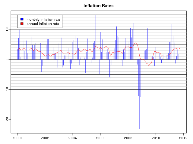
The Consumer Price Index can be used to compute inflation rates, which are simply the annualized rates of increase in the value of the index. After computing the annualized inflation rates (inflation.data), the above graph can be generated as follows:
from rpy import *
import json

data = json.loads(file("inflation.data").read())
years = [ x[0] + (x[1] - 1)/ 12.0 for x in data ]
monthlypct = [ x[2] for x in data ]
annualpct = [ x[3] for x in data ]

r.png("r_inflation.png", width=640, height=480)
r.par(mar=[2.5, 2.5, 2.5, 1.5])
r.par(mgp=[1.5, 0.5, 0])
r.plot(years,monthlypct,xlab="", ylab="", col="blue", type="n")
for i in range(-10,16):
    if i % 5 == 0:
        r.abline(h=i, col="black")
    else:
        r.abline(h=i, col="#d0d0d0")
r.title("Inflation Rates")
r.legend(2000, 14.8, [ "monthly inflation rate",
     "annual inflation rate" ], fill=[ "blue", "red" ])
r.lines(years, monthlypct, col="blue", type="h")
r.lines(years, annualpct, col="red")
r.dev_off()
SLGS Rates
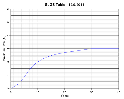
SLGS are securities offered for sale by the U.S. Treasury to issuers of state and local government tax-exempt debt. The issuers invest their tax-exempt debt proceeds in SLGS instead of regular Treasury Bills, Bonds, and Notes because of the flexibility the SLGS provide for reducing the yields earned in order to comply with the yield restriction or arbitrage rebate provisions of the Internal Revenue Code. The maximum SLGS rates allowed for subscription of these securities are published each business day by the Bureau of the Public Debt. After cleaning up the data (slgs.data), the above interest rate yield curve can be plotted with the following code:
from rpy import *
import json

data = json.loads(file("slgs.data").read())
slgsdate = data["date"]
years = [ x[0] / 12.0 for x in data["rates"] ]
rates = [ x[1] for x in data["rates"] ]

r.png("r_slgs.png", width=500, height=400)
r.par(mar=[3, 3, 2.5, 1.5])
r.par(mgp=[1.5, 0.5, 0])
r.plot([0,40],[0,6.0],xlab="Years", ylab="Maximum Rate (%)",
    type="n", xaxs="i", yaxs="i")
for i in [ 1,2,3,4,5,6,7,8,9,10,20,30 ]:
    r.abline(v=i, col="#e0e0e0")
for i in [ 0, 40 ]:
    r.abline(v=i, col="black")
for i in range(0,61):
    if i % 5 == 0:
        r.abline(h=i/10.0, col="black")
    else:
        r.abline(h=i/10.0, col="#e0e0e0")
r.title("SLGS Table - %s" % (slgsdate,))
r.lines(years,rates,type="l",col="blue")
r.dev_off()
Treasury Yield Curve
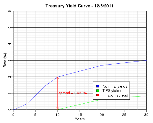
The Federal Reserve provides daily interest rate data for a variety of instruments. In particular, the data contains benchmark yields for the nominal Treasury yield curve and benchmark rates for the Treasury Inflation Protected Security (TIPS) yield curve. The spread between the two yield curves shows the inflation expectation of the market. The above graph was generated by the following python code using this data (treascurve.data):
from rpy import *
import json

data = json.loads(file("treascurve.data").read())
years = [ x / 12.0 for x in data["months"]]
tips_years = [ x / 12.0 for x in data["tips_months"]]

r.png("r_treascurve.png", width=500, height=400)
r.par(mar=[3, 3, 2.5, 1.5])
r.par(mgp=[1.5, 0.5, 0])
r.plot([0,30],[0,6.0],xlab="Years", ylab="Rate (%)", type="n", xaxs="i", yaxs="i")
for i in range(0,61):
    if i % 10 != 0:
        r.abline(h=i/10.0, col="#e0e0e0")
for i in range(1,30):
    r.abline(v=i, col="#e0e0e0")
for i in [ 0, 30 ]:
    r.abline(v=i, col="black")
for i in range(0,61):
    if i % 10 == 0:
        r.abline(h=i/10.0, col="black")
r.title("Treasury Yield Curve - %s" % (data["date"],))
r.lines(years,data["yields"],type="l",col="blue")
r.lines(tips_years,data["tips_yields"],type="l",col="green")
r.arrows(10, data["tips_ten_year_rate"], 10, data["ten_year_rate"],
    col="red", length=0.1)
r.arrows(10, data["ten_year_rate"], 10, data["tips_ten_year_rate"],
    col="red", length=0.1)
r.text(10.2, (data["ten_year_rate"] + data["tips_ten_year_rate"]) / 2,
    "spread = %.3lf%%" % (data["ten_year_rate"] - data["tips_ten_year_rate"],),
    adj=0, col="red")
r.legend(18, 1.7, [ "Nominal yields", "TIPS yields", "Inflation spread" ],
    fill=[ "blue", "green", "red" ])
r.dev_off()
Historical Yields
The Federal Reserve provides historical Treasury yield curve data in several different formats. For example, monthly yields for each length of Treasury security can be downloaded separately from 1 month, 3 month, 6 month, 1 year, 2 year, 3 year, 5 year, 7 year, and 10 year. Additionally, monthly yields for each length of TIPS can be downloaded from 5 year TIPS, 7 year TIPS, 10 year TIPS, and 20 year TIPS. We collect all of this data into a single file (historical.data) for further analysis.
3D Historical Treasury Yield Curve
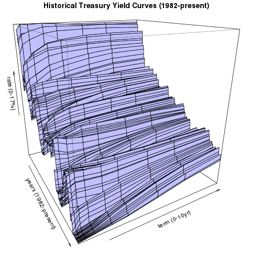
(click on image to rotate)
We can generate a 3-D plot of each of the regular (non-TIPS) historical yield data points. As anyone can see from this plot, although the Federal Reserve has raised short term interests every month since the middle of 2004, overall interest rates are still relatively low when compared to the historical yield curves since 1982. The python code to generate eight views from eight evenly spaced rotated angles for this 3D graph follows:
from rpy import *
import json
import operator

start_year = 1982
x = [ start_year + i / 12.0 for i in range((2011 - start_year) * 12) ]
y = [ 1, 3, 6, 12, 24, 36, 60, 84, 120 ]
yindex = {}
for i,term in enumerate(y):
    yindex[term] = i
zval = []
for i in range(len(y)):
    zval.append([r.NA] * len(x))

data = json.loads(file("historical.data").read())
for term,rates in data["treasury"].iteritems():
    j = yindex.get(int(term))
    if j is not None:
        for entry in rates:
            if entry[0] >= start_year:
                i = (entry[0] - start_year) * 12 + (entry[1] - 1)
                if i < len(x):
                    zval[j][i] = entry[2]

z = r.array( reduce(operator.add, zval), dim=[len(x),len(y)] )

for angle in [ 15, 60, 105, 150, 195, 240, 285, 330 ]:
    r.png("r_historical%03d.png" % (angle,), width=500, height=500)
    r.par(mar=[0, 0, 1.5, 0])
    r.par(mgp=[0, 0, 0])
    r.persp(x, y, z, theta = angle,  phi=20, col="#c0c0ff",
        xlab="years (1982-present)", ylab="term (0-10yr)",
        zlab="rate (0-17%)")
    r.title("Historical Treasury Yield Curves (1982-present)")
    r.dev_off()
Historical yields and spreads on 10yr TIPS
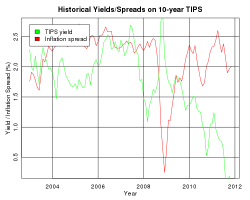
We can plot a brief history of 10 year TIPS rates and their corresponding inflation spreads versus the regular 10 year Treasury rates:
from rpy import *
import json
import operator

data = json.loads(file("historical.data").read())
years = [ x[0] + (x[1] - 1) / 12.0 for x in data["treasury"]["120"]
     if x[0] >= 2003]
rates = [ x[2] for x in data["treasury"]["120"] if x[0] >= 2003]
tips_rates = [ x[2] for x in data["tips"]["120"] if x[0] >= 2003]
spread = map(operator.sub, rates, tips_rates)

r.png("r_10yrtipsrates.png", width=500, height=400)
r.par(mar=[3, 3, 2.5, 1.5])
r.par(mgp=[1.5, 0.5, 0])
r.plot(years, spread, xlab="Year", ylab="Yield / Inflation Spread (%)",
     col="red", type="l", tck=1)
r.lines(years,tips_rates,type="l",col="green")
r.legend(2003.0, 2.7, [ "TIPS yield", "Inflation spread" ],
    fill=[ "green", "red" ])
r.title("Historical Yields/Spreads on 10-year TIPS")
r.dev_off()
Historical Monthly 10-year Yields
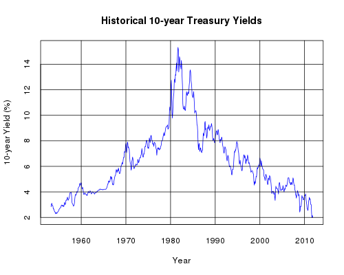
We can extract a subset of the data corresponding to the 10-year yields and plot that on a simple line graph:
from rpy import *
import json

data = json.loads(file("historical.data").read())
years = [ x[0] + (x[1] - 1) / 12.0 for x in data["treasury"]["120"] ]
rates = [ x[2] for x in data["treasury"]["120"] ]

r.png("r_10yrhistory.png", width=500, height=400)
r.plot(years, rates, xlab="Year", ylab="10-year Yield (%)",
    col="blue", type="l", tck=1)
r.title("Historical 10-year Treasury Yields")
r.dev_off()
Distribution of Monthly 10-year Yields
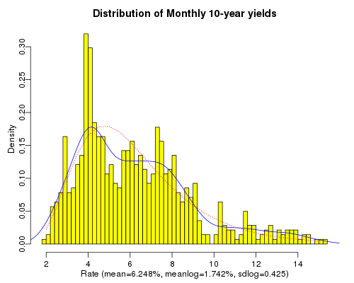
Continuing with the same data used in the previous graph, we plot a histogram that illustrates the probability of the 10-year yield falling on any given interval based on the historic yields. On top of that we layer in blue the density function that smooths the histogram into a density curve. Additionally, we plot in red a standard lognormal density curve using the historic mean of the logs of the data points and the historic standard deviation of the logs of the data points. This gives a rough picture of whether standard lognormal density functions may be useful for the purpose of forecasting future interest rates. The code to plot this follows:
from rpy import *
import json
import math

data = json.loads(file("historical.data").read())
rates = [ x[2] for x in data["treasury"]["120"] ]

logrates = [ math.log(rate) for rate in rates ]
xlabel = "Rate (mean=%.03f%%, meanlog=%.03f%%, sdlog=%.03f)" % (
    r.mean(rates), r.mean(logrates), r.sqrt(r.var(logrates)))
title = "Distribution of Monthly 10-year yields"
r.png("r_10yrdistrib.png", width=500, height=400)
r.par(mar=[3, 3, 2.5, 1.5])
r.par(mgp=[1.5, 0.5, 0])
r.hist(rates, nclass=50, xlab=xlabel, main=title, probability=True,
    col="yellow")
r.lines(r.density(rates), col="blue")
x = r.seq(2.0, 15.0, 0.5)
r.lines(x, r.dlnorm(x, meanlog=r.mean(logrates),
    sdlog=r.sqrt(r.var(logrates))), lty=3, col="red")
r.dev_off()
| [1] | Good references include: R Graphics, An Introduction to R. |